Graphing FTDNA family finder matches
I started doing some genetic testing with Family Tree DNA in 2009, and I ended up purchasing the Family Finder test in 2012. Its been fascinating information to find out, but finding provable links to anyone has been problematic.
With 2 exceptions my Family Finder matches start at the 3rd-5th cousin level - so suggesting that we match around 5 to 7 generations. This is right about the point where my paper trails start to have missing people, making it extra infuriating. Sometimes you can see a common surname in about the right place at the right time and theorise that the link is through there, but following up on that hasn't produced any firm links.
I convinced one aunt to test, which helped at least group a big section of people into one branch of the tree, but it still provided nothing more firm than that.
As FTDNA allow you to download a lot of the data, I figured that I should be able to do something programmatically to help sort out where people might match together. A first pass used downloads from the chromosome browser, 5 people at a time, and as it tried to build and display a structure in text, it wasn't very successful. I could tell that I didn't really have a good grasp of what the data was like by how fiddly and unclear the results I was getting were.
Finding myself with a tiny bit of spare time, I went and poked around online to see if I could find some graphing software that would be helpful. I wasn't looking for in-browser stuff, but I hit D3 and its graph examples quickly and thought I'd give it a go.
Data collecting
The data I was using was the downloadable list of matches from the FTDNA website. You can grab your full match, and then limit the matches to people who are in common with the first match and download that list too. Its a little bit time consuming, but it works. It'd be a lot easier if the website let you do more things by opening them in a seperate tab.
So, to be clear, I'm not really doing any dna data processing. I'm trusting FTDNA to doing the hard work, and I'm just displaying it to the screen. I'm sticking with their ordering and what they tell me shared cM and longest blocks are and trying to find a more intuitive way to display who is connected to who.
As I'm trying to make connections with people, I figured I would display each person that I had a set of matches for, and as a first pass, I'd download the in common matches for the first ten people on my match list and see what arose.
Venn diagrams
My first attempt to map the data was to build a Venn diagram - after all, the data should be mostly heirarchial, right? With people that I am closest to having large circles containing smaller circles with people related to a common ancestor further up the tree.
The first ten matches turned out to only have a couple of interrelations between them, so I also got the code to include a circle for anyone that I hadn't downloaded a match file for, but who was matched to two other people that I had.
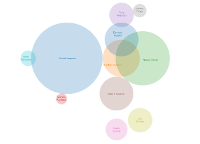
As soon as complicated multiple overlaps started to need to be displayed, it became clear that a venn diagram was not going to work.
Partly this didn't work because of the vagaries of DNA replication, where Jane is related closer than Tom or Bill, and Tom and Bill are related more closely than Angela, Belinda and Carrie, but Tom only now has matching segments long enough to match to Angela and Belinda, Bill matches all three of them, but Jane only matches Tom, Bill, Angela and Carrie. The further the matches - and mine are annoyingly far away - the worse it gets.
So when I tried to display things, there wasn't a neat heirarchy, but circles that didn't 100% overlap. And as soon as that was happening, then there were going to be times where I needed to represent 3 different circles which overlapped with two circles without overlapping each other properly and a two dimensional Venn diagram wasn't going to cut it.
I played with it a bit, seeing if I could do fuzzy matching (Tom matches Diane for all but 2 of 10 matches, that's close enough), but generally I reached a point where I could see it wasn't going to work.
So I went and browsed through the other d3 example graph types and found an example of a force directed graph.
Force Directed Graphs
At a first glance, it seemed that the randomness of this graph wasn't really going to be helpful (I had long term vague thoughts about trying to pin nodes down to a family tree graph, but they were very vague), but I thought I'd give it a go. I could put people in as nodes, and join lines to them where the data said they were matches in common. I made the node size relative to the shared cM. Then I changed that and made it relative to the longest shared cM - otherwise it was like trying to make a scale map of the solar system with my aunt being the sun. (Attempt #1).
As a first pass, it seemed to have some promise. The nodes were nicely displayed, a few of them were joined up. I was using the same set of data that I had tried out on the Venn diagram and it was a bit lacklustre, so I downloaded the next batch of 10 or so files plus some others that interested me. But rather than getting just clumps, I was getting long chains as well, some of them between people that I was more closely related to, and pretty sure that weren't related to each other. (Attempt #2).
So I went to the FTDNA website and did some manual poking with the common matches and the chromosome browser. And I found that while I might be related to person A and B, and they have each other in common, it doesn't necessarily mean that they are related to one another in the same ways I am related to them - or at least not in ways that have left the same DNA in the same places.
I wasn't really expecting much of this - different branches of my family come from consistently different places, so its somewhat intriguing to find that there might be crosslinking. I really shouldn't have been surprised, given that I've found enough of it in my paper genealogy research within Australia, but I didn't think it would extend to such a wider geographical area.
The next step was to download the csv from the chromosome browser, and use that to check whether when A and B matched each other, did they also match with me on the same chromosome. I don't really have the background knowledge to say "yes, this overlap is X cM its a match", and I wasn't aiming for high precision, so I decided to just treat things as a connection if there was any overlap at all.
That helped break some of the weird links and long chains, mostly leaving individuals without any links and intensely crosslinked groups. (Attempt #3).
This seemed like a positive line of enquiry, so I downloaded some more match files, and did the same process for some of the other kits I administer to see what different data might produce. The results for one kit were less dramatic, just a few links and one pentagram. Results for my aunt mostly mirrored my own, but with some subtle differences that might reflect generational closeness.
I added some options in processing to show the indirect links as dotted lines, or to remove individuals with no connections. There are options to change the minimum shared segment or longest segment before people who have multiple matches but no common match file of their own are included. These change the data file the graph uses, but ideally I'll put some of them in as controls on the graph page so they can be removed and added on the fly. I'd also like to add options for removing people or links, to help clarify some of the structures. Ideally I'd like to be able to also add controls that let you choose a person and only show their links.